.jpg)
롯데케미칼 타이탄 UX/UI 리뉴얼
Experience into structure, structure into feel.
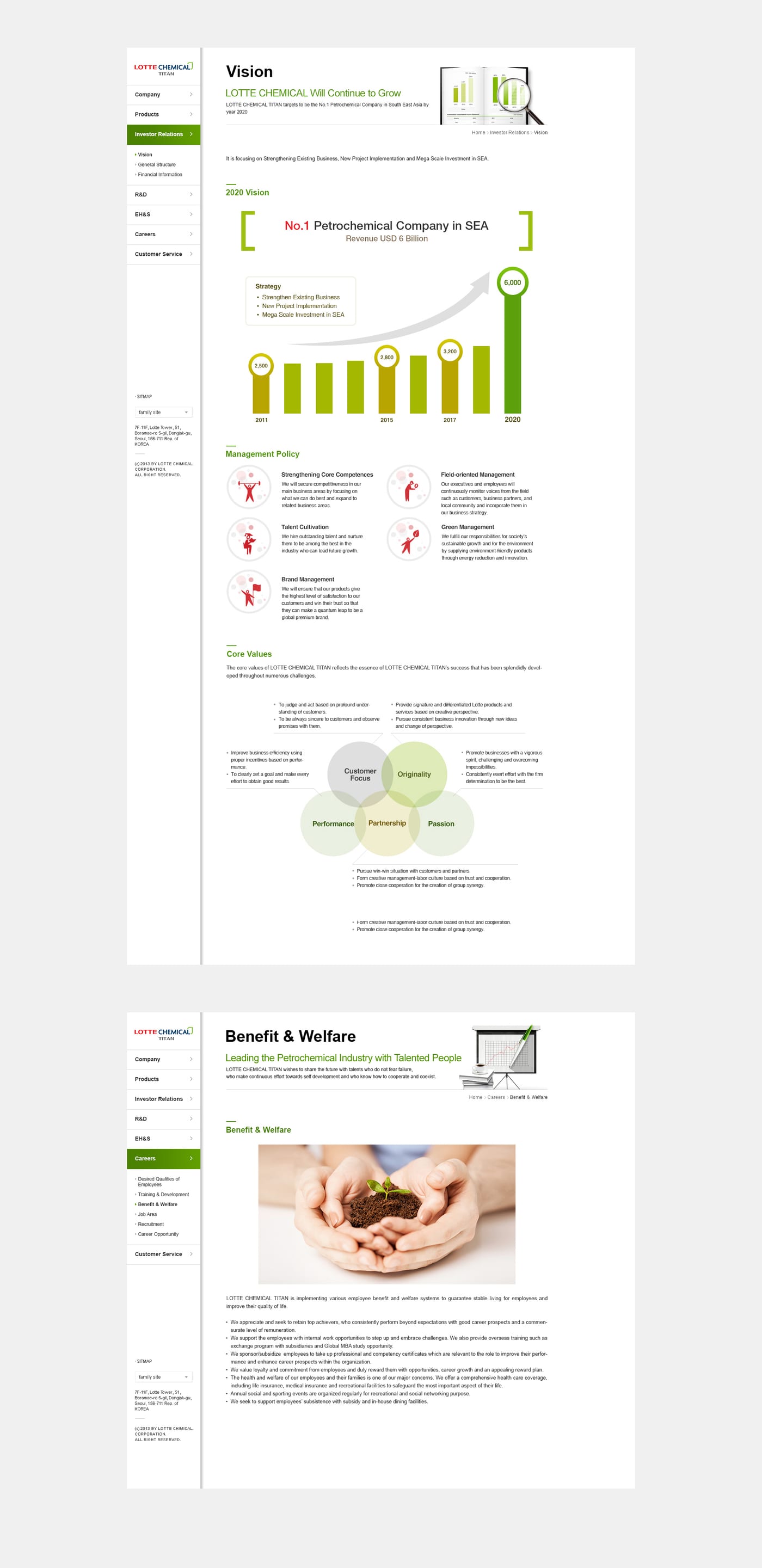
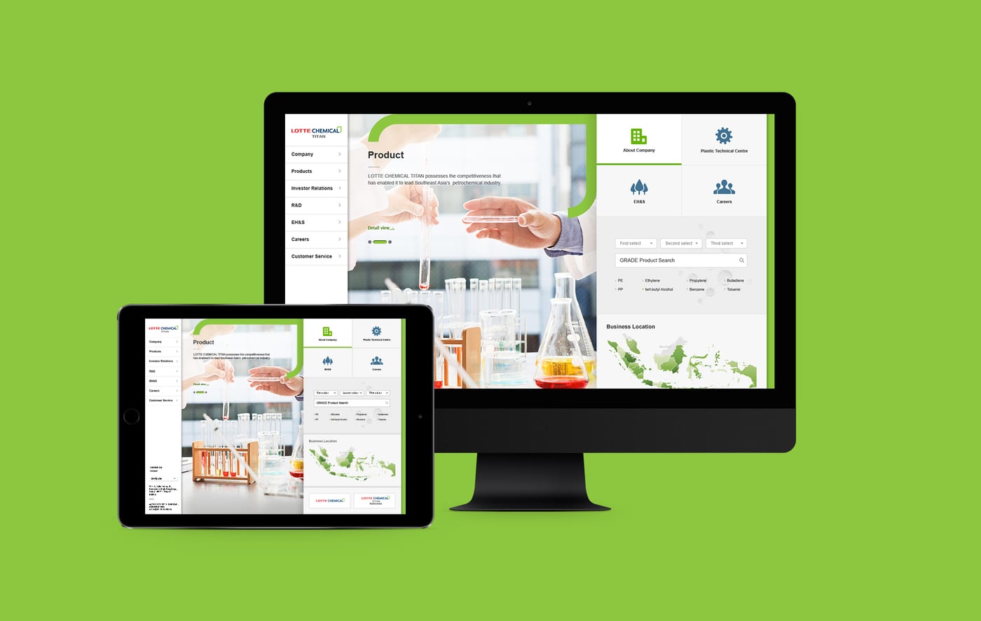
On this project with Lotte Chemical Titan, cream looked again at where the brand meets its users. We started not from what to show, but from what's needed, and when.
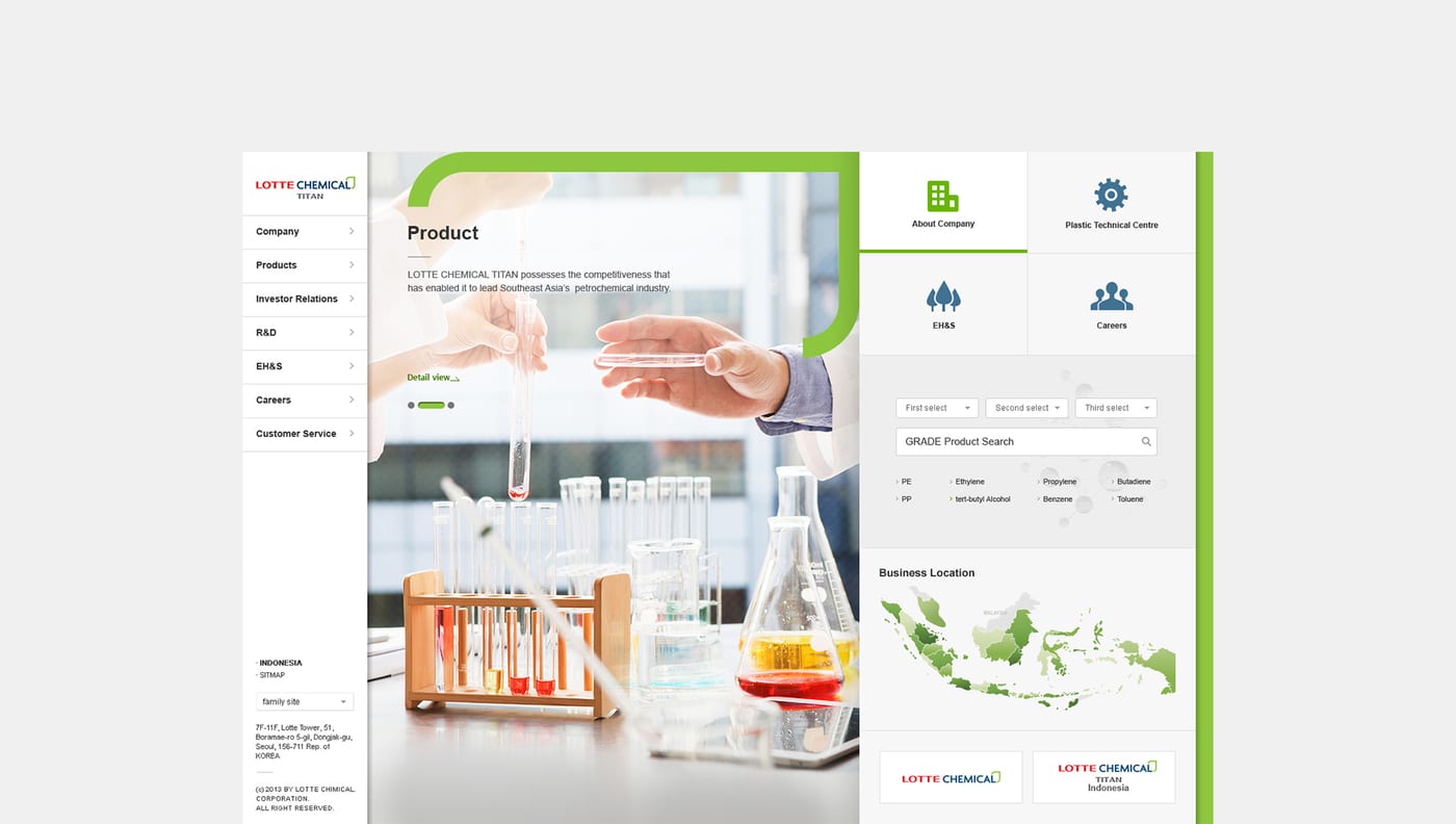
In the language of UX/UI, we rebuilt the hierarchy and flow of information. The screen grows clearer the more we take away, and users move to the next step without getting lost.
The result is more than a good-looking screen. It's an experience that lets the brand speak itself more precisely, carrying the standard cream has refined over twenty years.
Information hierarchy
We separated primary from secondary so the first screen is enough to decide.
User flow
We shortened the path from request to done, carrying users to the next action without drop-off.
Detail
We tuned type, space, and motion to the brand, so the whole screen speaks in one voice.


.jpg)