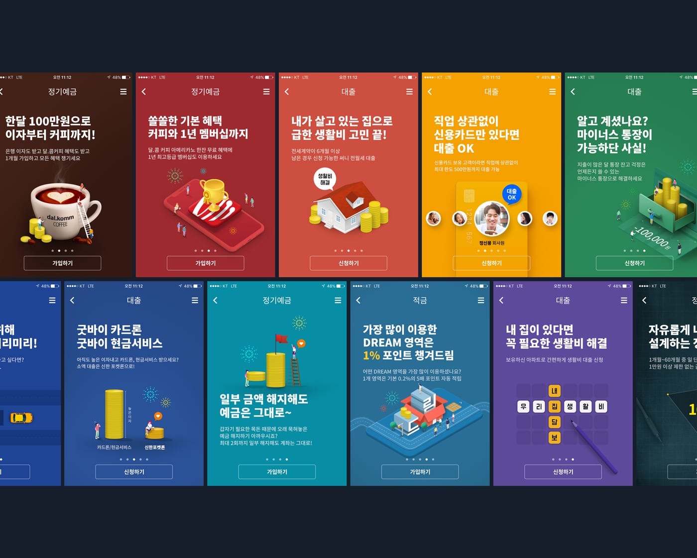
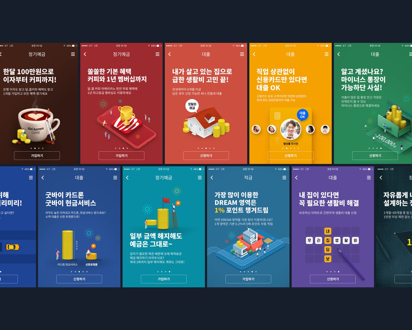
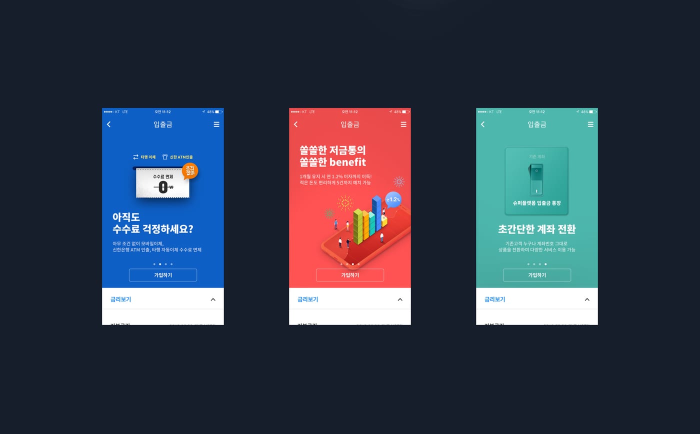
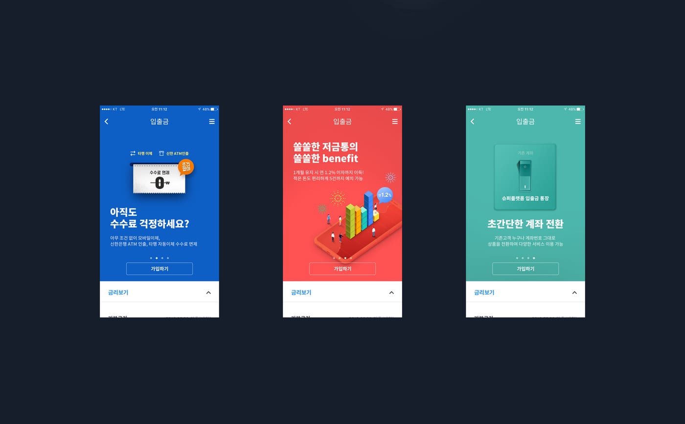
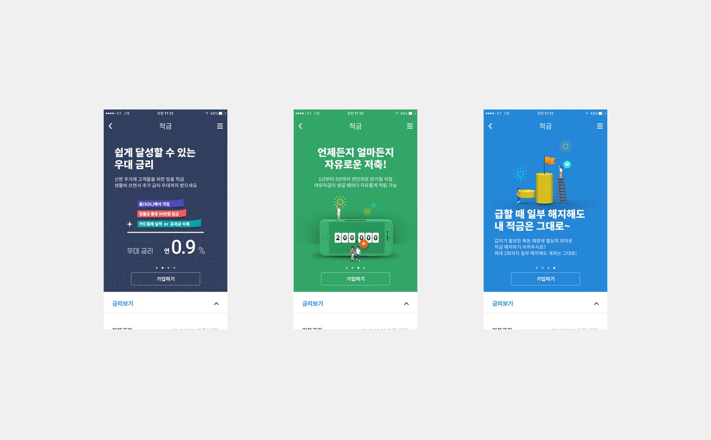
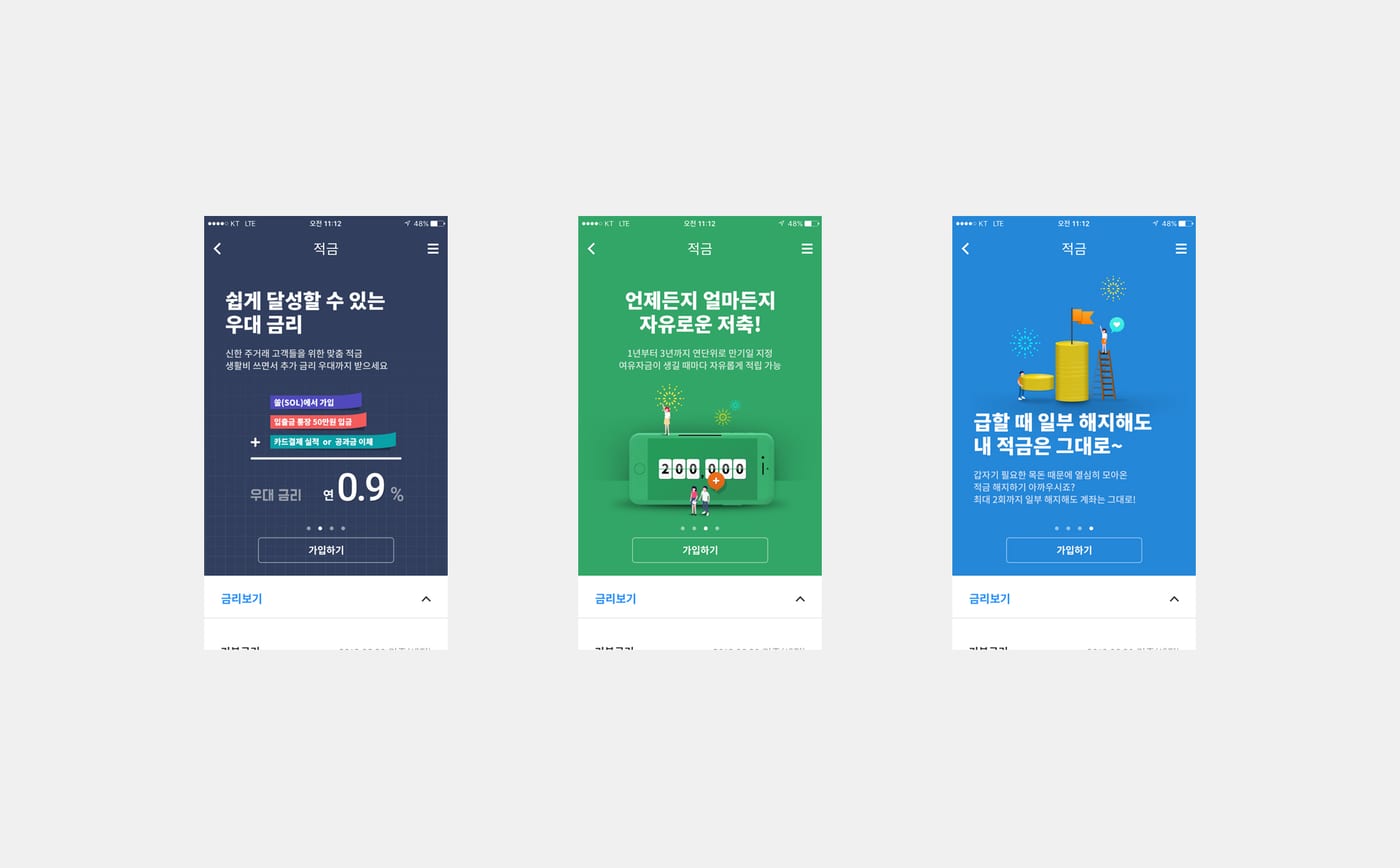
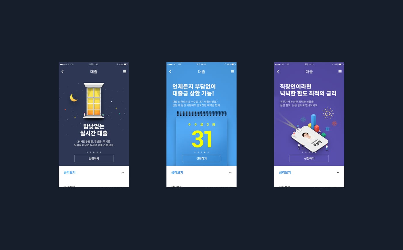
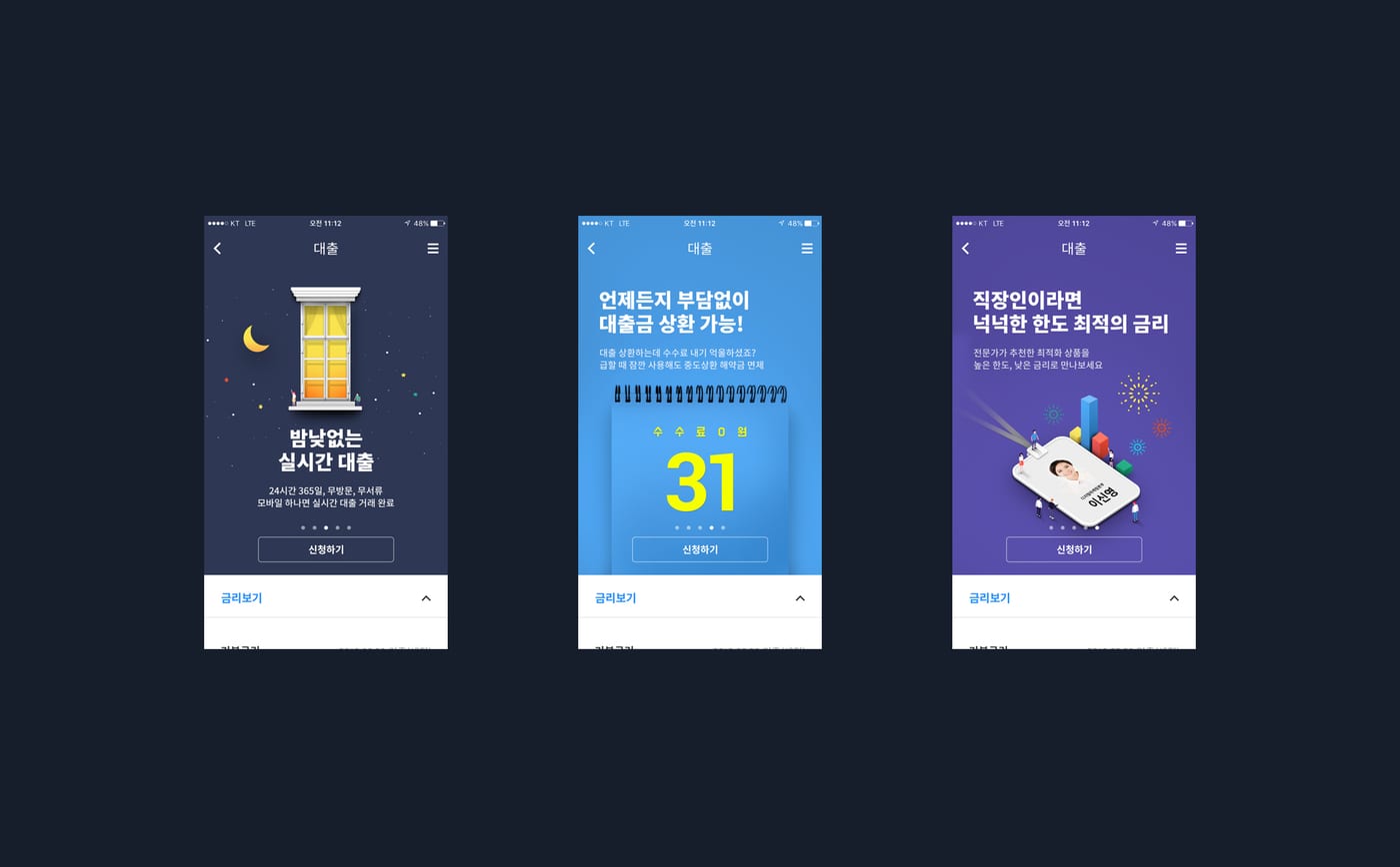
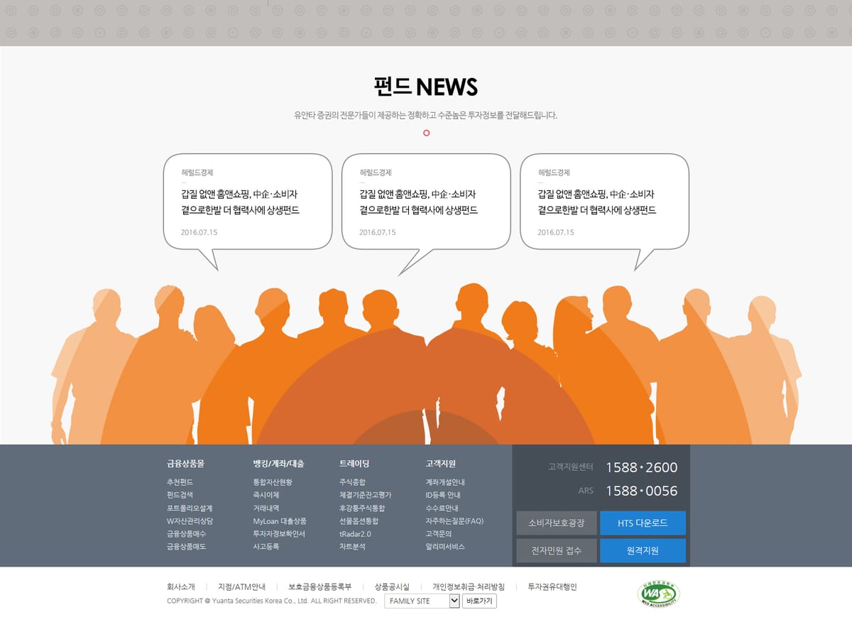
신한은행 SOL 디자인 UI/UX 가이드 제작
UX/UI

신한은행 SOL 디자인 UI/UX 가이드 제작

Launch
2018
Client
ShinhanBank
Scope
UX/UI
The Work

Experience into structure, structure into feel.

On this project with ShinhanBank, cream looked again at where the brand meets its users. We started not from what to show, but from what's needed, and when.

In the language of UX/UI, we rebuilt the hierarchy and flow of information. The screen grows clearer the more we take away, and users move to the next step without getting lost.

The result is more than a good-looking screen. It's an experience that lets the brand speak itself more precisely, carrying the standard cream has refined over twenty years.

Design Notes
Structure

Information hierarchy

We separated primary from secondary so the first screen is enough to decide.

Flow

User flow

We shortened the path from request to done, carrying users to the next action without drop-off.

Craft

Detail

We tuned type, space, and motion to the brand, so the whole screen speaks in one voice.

Case Gallery
Case images are synced from our archive over time.
신한은행 SOL 디자인 UI/UX 가이드 제작 1신한은행 SOL 디자인 UI/UX 가이드 제작 2신한은행 SOL 디자인 UI/UX 가이드 제작 3신한은행 SOL 디자인 UI/UX 가이드 제작 4신한은행 SOL 디자인 UI/UX 가이드 제작 5신한은행 SOL 디자인 UI/UX 가이드 제작 6신한은행 SOL 디자인 UI/UX 가이드 제작 7신한은행 SOL 디자인 UI/UX 가이드 제작 8
Project Info
Client
ShinhanBank
Year
2018
Category
UX/UI
Scope of Work
UX/UI
Want to build an experience like this together?
Start a Project
More Works